Jokilaakson Juusto Clarified Butter
Visual Identity, Packaging Design, Illustration
-
Jokilaakson Juusto, a Finnish family-owned company specializing in cheese, spreads, and plant-based products, wanted to revamp their outdated packaging for their clarified butter. While the product was selling well among their existing customers, it needed a fresh and premium look to attract new buyers. The new packaging design drew inspiration from the French culinary world and bistro aesthetics, giving it a modern vintage feel. The typeface used, Orelo by Pizza Typefaces, was a contemporary twist on the classic French Didot.
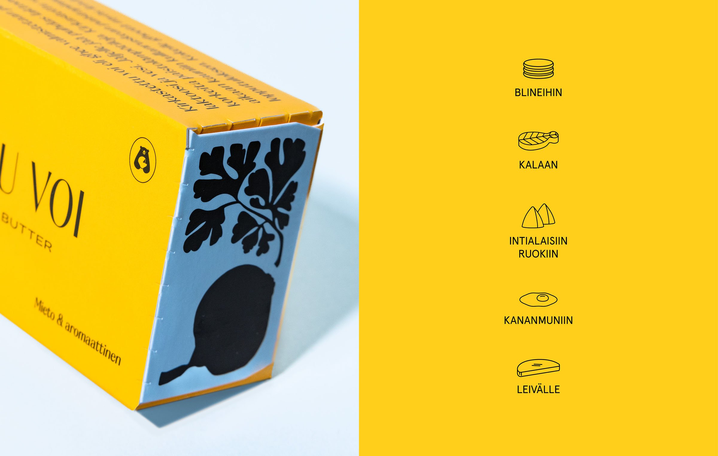
The yellow packaging color communicates the product's content, while the full bleed and bold design make it stand out on the shelf. The light blue accents add a refreshing touch, and the illustrations on the packaging demonstrate the product's uses, encouraging customers to take a closer look. The straightforward communication on the packaging, both through written text and icons, helps customers understand how to use the product. The target audience for this redesign includes foodies, those curious to try new products, and professional chefs who appreciate clarified butter's higher smoke point.