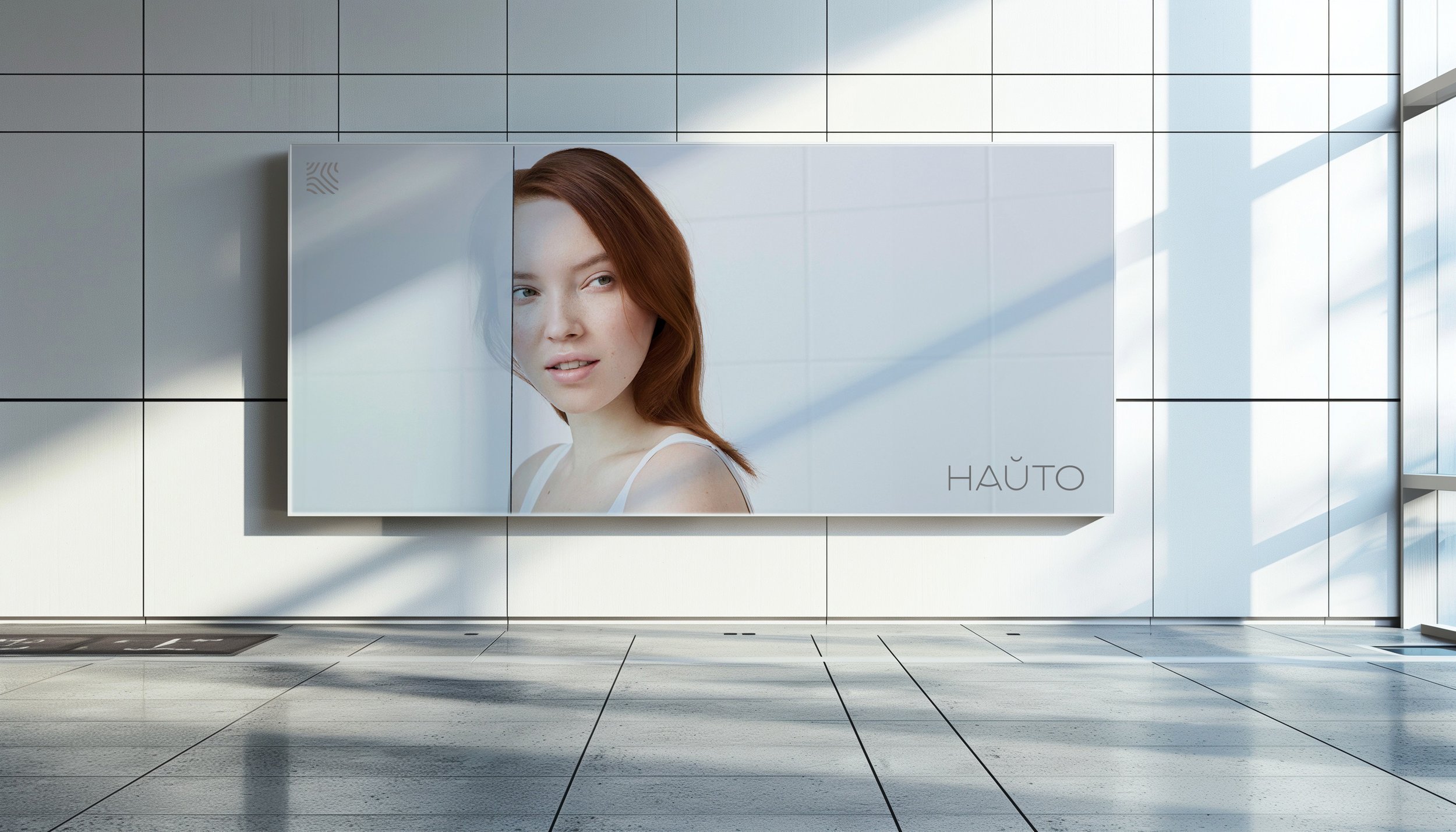
Hauto skin test
Branding, Visual identity, Packaging Design, UX/UI Design, Art direction,
-
The brief was to create a packaging for a unique and new type of patented skin test that would be sold in the beauty and wellness market. The packaging had to look good and credible. The skin test consists of two parts of different sizes, one of which had to be in an air-tight package and we had to find a way to package the parts so that they would not be moving around inside the outer package. The box had to be sturdy, but also foldable for transportation.
The skin test is medically qualified and developed by chemists, so the packaging has to communicate this scientific qualification. However, the packaging shouldn't look too medical. The product would be sold in beauty and wellness departments, so it has to stand out and arouse interest in that surrounding. The solution was to make it look like a perfume or a cosmetic product, but with colour and clinical look of a pharmaceutical product.
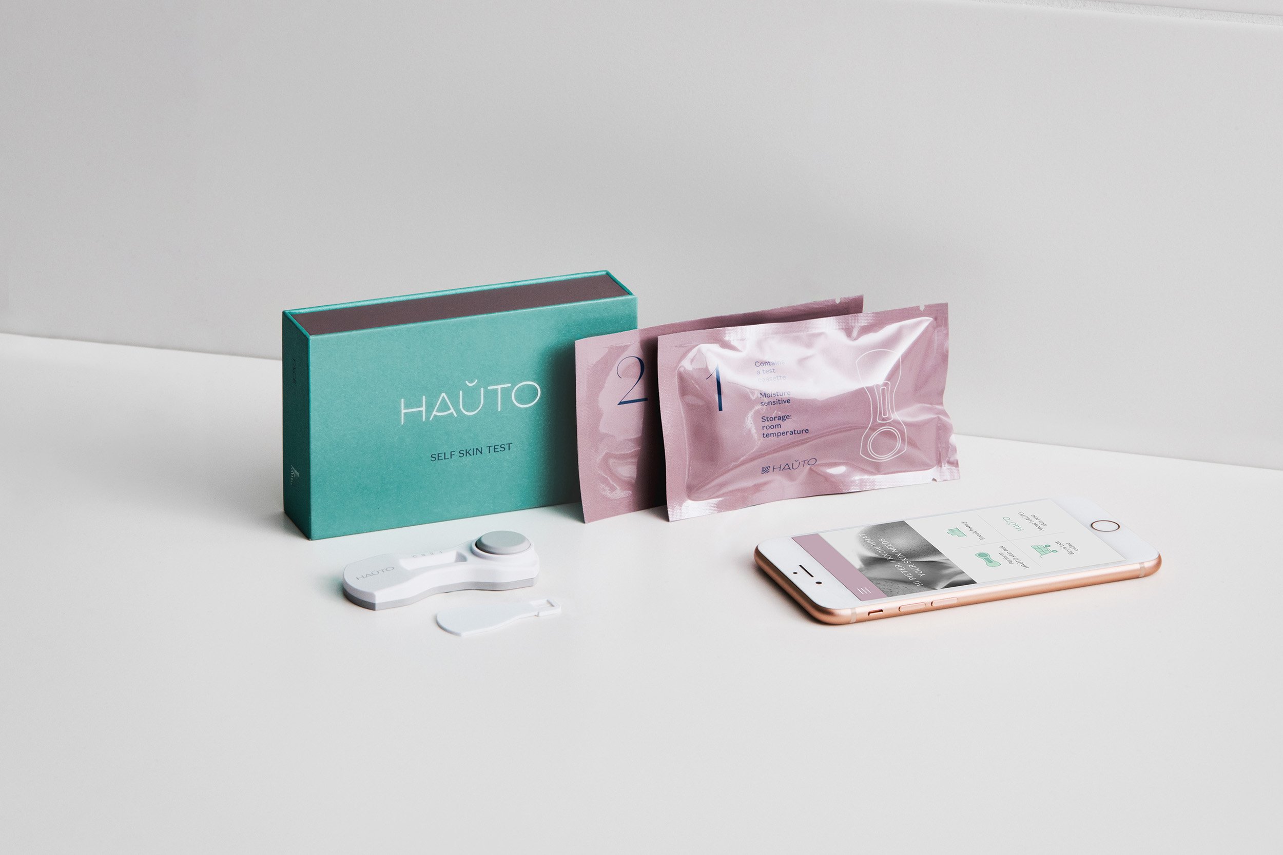
The structure is a hard box that can be stored and transported flattened and can be assembled at the place of filling. Due to the compact size of the package, there is no unnecessary empty space. Opening the box is a pleasant experience with the magnet lid that opens to the side, revealing the surprise inside.
The test parts are very different in size and only one required an airtight pouch. However, both parts were packaged in an airtight bag, to make it cost-effective and enabled them to remain stationary during transport without having to have any separate inner structures in the box. In addition, the sealed bags keep the parts hygienic and assure the customer that they have not been used.
The graphics were kept simple and informative. The numbers in the pouches indicate the order in which the test components are used. The font is sophisticated and clear Domaine Sans, which differences in thickness make it lively and interesting.
Teal is a common colour in pharmaceuticals, and to make it more refined, it is softened towards grey. The second colour chosen was blush pink, which connects the product with the beauty world. The silver details and metallic colour combined with the uncoated matte paper create an interesting contrast and give the product a valuable and credible look.


