Studio Puisto
Branding, Web Design, Art Direction, illustration
-
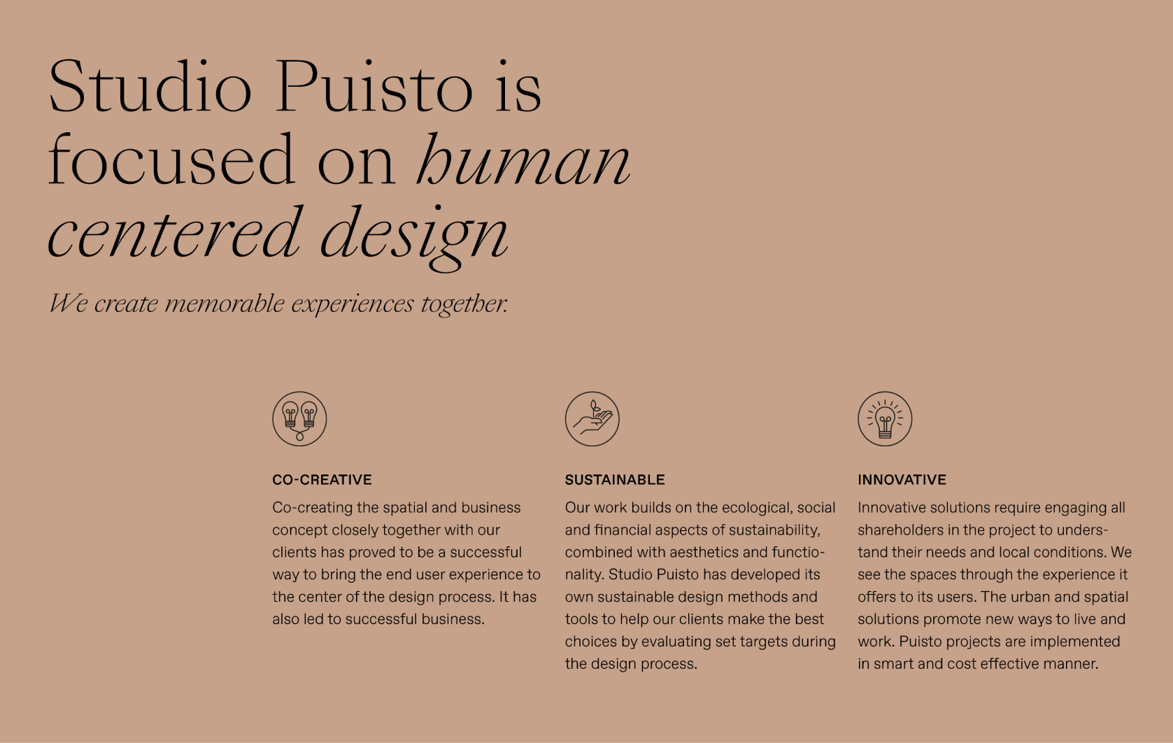
Studio Puisto, an award-winning architecture and interior design studio, wanted a rebranding that would better match their body of work. Studio Puisto creates beautiful buildings and interiors that feel luxurious yet down-to-earth and cozy. Their main focus will be hospitality, and they wanted their branding to communicate the high level of their work. However, they did not want to feel like every other architecture company: black-and-white with minimal type felt too cold for them. They focus on human-centered design and wanted that to show as well. The new branding reflects their softer values of sustainability and human-centered design, supports their beautiful case study imagery, and feels approachable, fresh, and timeless, just as their architecture and spaces do. Both the logotype and typography have more character and refinement, and the colors are natural yet luxurious, creating a sense of calm and peace.
The old branding of Studio Puisto felt cold, bland, and outdated and didn’t match well with their body of work. The color palette didn’t feel high-end enough, and there were not enough colors to play with. The typography was geared toward the mass market, but now they wanted to have something with more personality and sophistication. The website had to be more engaging and create more storytelling.
The logo was updated so that symbol, which everyone liked, was kept but given a face lift. It was simplified and given a bit more organic look. The old logotype lacked personality and recognizability, so we kept the geometric shape of the letters, but changing them to lowercase made it already much more distinguishable. The little details in the dots of the i, and in the indents give the logo an organic feel, and add to the meaning of the name: a park (=puisto).